Every dashboard was green. Customers were still failing.
Gray failures are partial, silent outages that green dashboards never flag. Here is how Databricks catches them with anomaly detection, and how to practice the same idea in Free Edition.
Every health check said the system was fine. CPU healthy. Latency normal. Servers up. Database connected.
Meanwhile, one in twenty customers trying to pay by credit card was silently failing. They retried a couple of times, gave up, and left.
The first support ticket landed three hours later. It looked like a mistyped card number, so nobody blinked. Two more tickets arrived. Then a support lead spotted the pattern and escalated. Engineers found the bug and shipped a fix.
Total time: nearly seven hours. For seven hours, the monitoring insisted everything was fine while customers walked and revenue leaked.
This is not a made-up horror story. It is the exact scenario Databricks described in an engineering post published this week, and it has a name: a gray failure. Their answer to it is a system called RADAR, and the interesting part for us is not the name. It is that gray failures are, at their core, a data engineering problem.
What exactly is a gray failure?
A gray failure is a partial, quiet breakdown. Everything looks healthy on the surface, but one specific slice of the system has stopped working.
Two properties make it sneaky.
It is partial. Not everyone is affected, just one slice. One card type. One region. One cluster size. There is no server crash to catch. Most users are fine while one group fails the entire time.
And it grows. What starts as a handful of affected customers spreads the longer it runs. Think of it as smoke behind a wall. From outside, the house looks fine. Inside, the damage is compounding.
Researchers at Microsoft gave the underlying problem a name years ago: differential observability. Your failure detectors do not see a problem even while your users clearly do. Your monitoring watches servers. Your customers experience journeys. Those are not the same view.
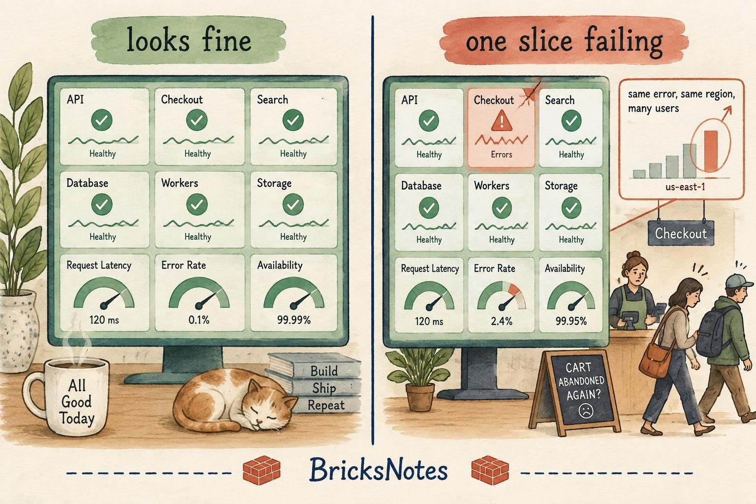
Your customers should not be your monitoring system
Most teams discover gray failures the way that Wednesday played out: they wait for customers to tell them.
Customer reports matter. They are real human pain. But leaning on them alone has three problems.
It is manual. Someone has to notice the same complaint across a pile of tickets. Easy to miss.
It is delayed. By the time enough people complain for anyone to connect the dots, hours or days have passed.
It is silent. Most affected customers never file a ticket at all. They just leave.
The fix is not to stop reading tickets. It is to add automatic detection that runs all the time and catches what people miss.
Concretely, you want something that fires the moment a lot more customers than usual start hitting the same issue at the same time. That sentence is important, so read it again. It is not a monitoring sentence. It is a data sentence.
Meet RADAR
RADAR stands for Reliability Anomaly Detection, Alerting, and Root-cause analysis. Databricks built it for themselves to catch gray failures in minutes instead of hours.
The clever move is which signal they point it at: user errors.
A gray failure often shows up as a sudden spike in errors that look like the user's fault. Picture a bunch of users in one region who suddenly cannot start a certain type of cluster. Each request fails with INVALID_ARGUMENT, an error politely saying "this one's on you." But when many users hit the same "your fault" error at the same moment, it stops being their fault. It is yours.
That spike is exactly the pattern RADAR catches, through four stages.
Stage 1: Reliability metrics. At every point in time, record two things: how many errors are happening, and how many separate users hit each one. Break it down by error code and region. Now you have a rich set of time series describing the health of your service.
Stage 2: Anomaly detection. Run anomaly detection on each series so the system flags anything that looks off, without hand-tuning a pile of thresholds. Databricks uses an unsupervised streaming model called SPOT, which learns what normal looks like from the past 14 days and needs a single risk parameter instead of manual cutoffs.
Stage 3: Alerting. When something fires, this layer enriches the alert with context, filters what is not significant, and dedupes so the on-call engineer is not buried under copies of the same alarm. Then it files a ticket routed to the right team.
Stage 4: Root-cause analysis. Every ticket arrives with deep-dive details and a link to a dashboard backed by an AI assistant, so whoever is on call goes straight to figuring out what broke.
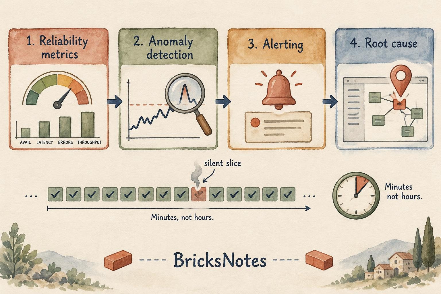
The results Databricks reported: a 95 percent reduction in incident-discovery time, at over 90 percent precision, with no human needed to spot the pattern. Incidents that used to surface through days of customer tickets now surface in minutes.
Why this is a data engineering story
Here is the part worth pausing on.
Strip away the word "reliability" and look at what RADAR actually is. Raw events get ingested. They get aggregated into clean, governed metrics. A model reads those metrics. An alert is a downstream consumer of a curated table. The dashboard is another.
That is a medallion architecture wearing an SRE costume. Bronze is the raw error events. Silver is the deduplicated, well-typed event stream. Gold is the per-slice time series: error counts and distinct affected users by error code, by region, by minute.
A gray failure is invisible in the bronze layer and obvious in the gold layer. The detection model is only as good as the tables it reads.
This is the same lesson from our medallion architecture guide and the pipeline observability article: the teams who catch problems early are not the ones with more dashboards. They are the ones who modeled the right signals as data.
If you have worked through the data quality lesson, you have already built a small version of this: expectations and checks that flag when a table stops looking normal. RADAR is that same instinct, pointed at live service metrics instead of pipeline tables.
The same pattern works for any metric
RADAR does not care what the metric is. Databricks points it at user errors, but the pattern works anywhere a number can quietly go wrong.
- Payments and transaction failures, billing anomalies, fraud signals
- Checkout conversion, cart errors, delivery times
- Patient throughput, claims processing
- Model performance and data drift that shows up before a model visibly breaks
Anywhere something could quietly go wrong for one slice of your users, the four stages apply. This connects directly to the idea we explored in Your AI agent does not have a semantic problem: the numbers only protect you if everyone agrees on what they mean. "Error rate by region" has to be one governed definition, not five queries in five notebooks.
Build it yourself on Databricks
Every piece of RADAR maps to something that already exists on the platform:
- Reliability metrics: Zerobus for low-latency ingest, Delta Lake for storage, Unity Catalog and metric views for governance
- Anomaly detection: MLflow for model training, Model Serving for the endpoint, scheduled jobs to run detection on a cadence
- Alerting: Databricks SQL Alerts
- Root-cause analysis: AI/BI Genie and AI/BI Dashboards
- Deployment: the whole thing ships as one unit through a Declarative Asset Bundle
Databricks also published a scaffold on GitHub: one markdown file that works like a recipe, mapping each part of RADAR to a specific component. You bring your own metric, hand the metric, the scaffold, and a short prompt to an AI agent, and it builds the system for you.
One honest note. Some of these pieces, like Model Serving, SQL Alerts, and Genie, require a paid Databricks workspace. The concepts are explained here for understanding, and the practice below runs in Free Edition.
Try the core idea in Free Edition
You cannot rebuild all of RADAR for free, but you can practice its heart: turning raw events into per-slice signals and detecting a weird one. All you need is a notebook and a Delta table.
First, create some fake service events. Most slices look normal. One slice is having a bad day.
CREATE OR REPLACE TABLE workspace.default.service_events AS
SELECT
  CAST(event_time AS TIMESTAMP) AS event_time,
  region,
  error_code,
  user_id
FROM VALUES
  -- normal background noise
  (current_timestamp(), 'us-east', 'INVALID_ARGUMENT', 'u1'),
  (current_timestamp(), 'us-west', 'INVALID_ARGUMENT', 'u2'),
  -- one slice quietly failing: same error, same region, many users
  (current_timestamp(), 'eu-central', 'INVALID_ARGUMENT', 'u10'),
  (current_timestamp(), 'eu-central', 'INVALID_ARGUMENT', 'u11'),
  (current_timestamp(), 'eu-central', 'INVALID_ARGUMENT', 'u12'),
  (current_timestamp(), 'eu-central', 'INVALID_ARGUMENT', 'u13'),
  (current_timestamp(), 'eu-central', 'INVALID_ARGUMENT', 'u14')
AS t(event_time, region, error_code, user_id)
Then aggregate into the RADAR-style signal: error count and distinct affected users, per slice.
SELECT
  date_trunc('HOUR', event_time) AS bucket,
  region,
  error_code,
  COUNT(*) AS error_count,
  COUNT(DISTINCT user_id) AS affected_users
FROM workspace.default.service_events
GROUP BY ALL
ORDER BY affected_users DESC
That second query is stage one of RADAR in miniature. affected_users is the key column. One user retrying five times is noise. Five users failing once each, in the same region, with the same error, is a signal.
In a real system, stage two replaces your eyeballs with a model that learns each slice's normal range. SPOT is one option. A simple z-score over the trailing 14 days gets you surprisingly far, and you can write it in plain SQL with AVG and STDDEV over a window.
The habit to build: for every number your business quietly depends on, ask what its per-slice time series looks like, and who or what is watching it.
The context angle
This is The Context Advantage showing up in operations clothing. Detection is only useful when the system knows the context (what normal looks like for this slice), teams keep control (alerts route to the right owner, with dedup and filtering), cost stays sane (one unsupervised model, no army of hand-tuned thresholds), and you keep choice (the pattern is metric-agnostic, so it moves from payments to models without a rewrite).
Green dashboards were never proof that customers were okay. They were proof that your servers were okay. The gap between those two sentences is where gray failures live.
The best outcome is not a faster response to angry customers. It is that your customers never have to discover your incidents for you.
Sources: RADAR: Catch gray failures with anomaly detection (Databricks Blog, September 19, 2026), Microsoft Research: Gray Failure: The Achilles' Heel of Cloud-Scale Systems, and Siffer et al., Anomaly Detection in Streams with Extreme Value Theory (KDD 2017).